When a “K” Looks Like an “N”: Inside the New Balance–Kiprun Trademark Dispute
When a “K” Looks Like an “N”: Inside the New Balance–Kiprun Trademark Dispute
A single letter has become the centre of a growing trademark battle in the running-shoe industry.
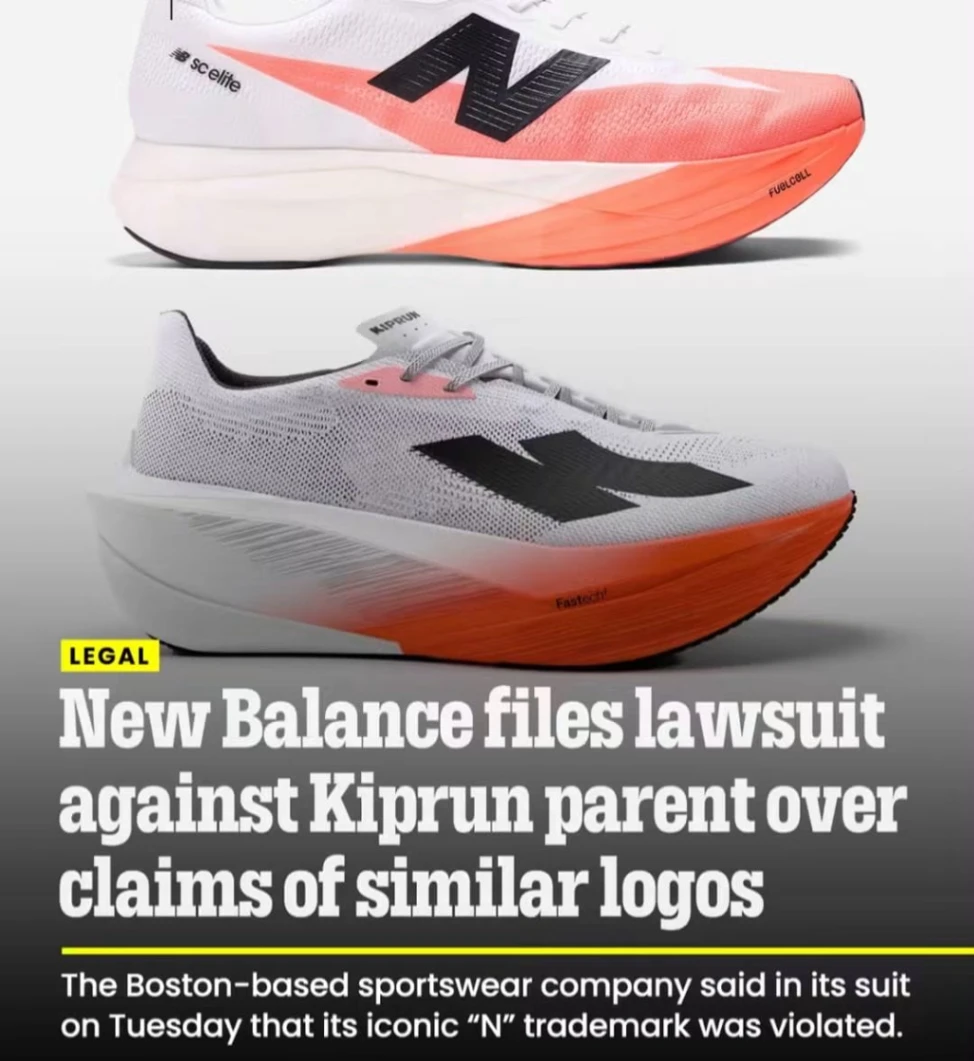
New Balance is suing Decathlon over the logo used by its KIPRUN running brand, arguing that the stylised mark used on KIPRUN shoes is too similar to New Balance’s iconic “N.” Decathlon, meanwhile, maintains that its symbol is a “K”, not an “N.”
The dispute was filed in the U.S. District Court for the District of Massachusetts on September 15, 2026, putting two major names in running footwear on opposite sides of a question that looks deceptively simple: When does a stylised letter become too similar to another brand's trademark?
The K that started the argument KIPRUN unveiled a new visual identity in April 2025 as part of a major repositioning of its running business.
Decathlon says the new symbol was inspired by the shape of a starting block, representing support, impulse and dynamism. The company explicitly describes it as a “K”, integrated into the KIPRUN wordmark.
On paper, the explanation seems straightforward: K for KIPRUN. But trademarks are not judged simply by what a designer intended. A central issue is how consumers may perceive the mark when they encounter it in the marketplace.
That is where New Balance enters the picture. New Balance sees an N New Balance has used its distinctive N on footwear for decades and argues that the KIPRUN design, particularly when presented in a mirrored form, can look remarkably similar to its own trademark.
According to New Balance's lawsuit, the mirrored version of KIPRUN's symbol can appear to consumers as an N rather than a K. The company argues that this creates a likelihood that consumers could mistakenly believe that KIPRUN shoes are connected with, endorsed by or produced by New Balance.
New Balance has also pointed to examples of online discussions in which runners apparently interpreted the KIPRUN symbol as an N. Those examples form part of the company's argument concerning potential consumer confusion.
Why the placement on a running shoe matters This isn't simply a dispute over two letters on a piece of paper. Both brands operate in the performance-running market, and their logos are prominently displayed on the side of running shoes—precisely where runners are accustomed to identifying brands.
New Balance argues that this is particularly important because running shoes are frequently seen away from the point of purchase: on race courses, at training sessions, in photographs, on social media and on sponsored athletes. Its complaint therefore raises the concept of “post-sale confusion”—the possibility that someone who sees a runner wearing the shoes later could mistake the brand or believe there is an association between the companies.
New Balance says its N is a valuable trademark New Balance's position is also built on the long history and recognition of its N mark.
The company says it has used the letter on footwear since the 1970s and has invested heavily in promoting its N trademarks. It has previously taken legal action against other companies over allegedly similar N-shaped footwear marks.
That history matters because New Balance is not arguing simply that it owns the letter “N.” Its case concerns the particular stylisation, presentation and marketplace recognition associated with its trademark. KIPRUN's position Decathlon's reported position is essentially that the symbol is a K, developed specifically for KIPRUN and inspired by a starting block. That distinction could become important in the litigation. The question before the court will not simply be “Does KIPRUN say it is a K?” Nor will it simply be “Does New Balance say it looks like an N?”
The broader trademark question is whether the use of KIPRUN's design is likely to cause consumers to believe there is a connection between the two brands. That is a much more complicated question. A fascinating battle for the running market The timing is significant. KIPRUN has been investing heavily in performance running, including carbon-plated racing shoes and products aimed at serious runners. Its 2025 rebrand was intended to establish a stronger identity for the brand and position it more prominently within the running world.
New Balance, meanwhile, has built enormous recognition around its N logo. So this isn't merely a fight over typography. It is also a clash between two increasingly visible players in performance running. For runners, the visual irony is hard to miss: KIPRUN says K. New Balance sees N. And now a court will have to decide whether the similarity crosses the line protected by trademark law. What happens next?
New Balance is seeking court orders that would prevent Decathlon from continuing to use the disputed design, along with measures including recall or destruction of affected products and monetary damages.
The case is still at an early stage. No court has yet ruled that KIPRUN infringes New Balance's trademarks. The allegations in the lawsuit remain allegations unless and until established through the legal process. For the running industry, however, the dispute presents an intriguing question about modern branding: If a company creates a letter for its own name, but consumers see another company's famous letter, where does creative branding end and trademark infringement begin? That is the question sitting behind the K versus N battle—and it could have consequences well beyond these two brands.
In the meantime, every time a runner sees that KIPRUN logo, there is a fascinating little branding experiment happening: Do you see a K… or do you see an N?